Color Star Wars! Color has its rules, and you can trip over them if you aren’t watching. Three power couples -The Complementaries: Red and Green, Orange and Blue, Yellow and Purple-rule the color wheel. As a painter you’ve got to know how to deal with them, or they can ruin your painting experience. Handled with a respect for their nature, they’ll 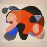 help your art work move ahead
Many novice painters working on their own can’t figure out why, when they mix color with every good intention and lots of passion, they achieve a muddy result instead of the color they want. The unintentional mixing of complements or near complements (more on these later) is often the reason.
So let’s focus on this one aspect of complements, namely their ability to neutralize each other! You can harness this color capacity to create beautiful neutrals for your paintings and also avoid slipping accidentally into the mud by spending time experimenting with just one complementary color pair, and white.
Use your paints to experience the principles you’re learning about and they’ll become part of your firsthand experience as an artist. Rather than just information you’ve given a passing nod to in a book. These principles will be the same no matter what painting medium you use (we use acrylics in my classes and books for beginners.)
You can locate each of these complementary pairs sitting directly opposite from one another on the color wheel. Google an image of an extended color wheel if you haven’t got access to one.
The color wheel is an illustration of color relationships that exist in the color spectrum. When you think of the color spectrum of light that exists in the natural world think of a rainbow to visualize its existence.
Paint colors give us an equivalent to the colors we see on the wheel, and therefore, in nature .To experiment with complements, start with orange (cadmium red light) and ultramarine blue, plus white. Mix them together (go ahead now!) to see how they neutralize (told you Star Wars!) one another. A “nothing” color (my mother’s apt name for them) also called optical gray or a neutral will result. To see the resulting neutral more clearly, add a little white to it.
When one of my students saw this happen her comment was: “Wow, this is major!” (Yes, adults can be blown away.) And it is major.
 The resulting neutrals are rich and varied. Depending on the higher concentration of a particular parent color in the mix, that color will dominate the resulting mixture. In an orange/blue mix, a rusty neutral will result if the orange percentage is higher, while a purplish result indicates that the blue is dominant.
You can tip the balance here by adding more blue, or more orange to the mixture you make. Add a little white to the edge of your mixture and you’ll find respectively a more pinkish (more orange in there) or gray purple (more blue) to help you identify the nature of the original mixture. This dynamic holds true for the other complementary pairs. Try it out. This is like a kinder, gentler video game!
Near complements are another source of colorful neutrals. These are the remaining colors, other than the classic complementary pairs, that you’ll see opposite each other on the color wheel. For example: mixing yellow green and purplish red will give you a neutral.
Earth colors like burnt sienna, yellow oxide or ochre, burnt umber, aren’t found on the color wheel. However, when they have color qualities of wheel colors you can use them to neutralize as well. For example:
- Burnt sienna-a rusty (orange) , and blue
- Yellow oxide aka yellow ochre – mustard (yellow), and anything close to purple, like violet.
- Burnt umber and ultramarine blue…a mix that will give you a perfect black substitute, and with white added a variety of beautiful grays. I call it “faux black”.
- (Think of near complements in the earth color category like yellow oxide as akin to a celebrity look alike…not so brightly dazzling as cadmium yellow medium (primary yellow) but similar (“Hey doesn’t that look like Primary Yellow!!? Well sort of, but not quite. Maybe she’s an understudy?”). And by the way, nothing dulls a color mixture faster than using a yellow oxide, when you should use a cadmium yellow medium. Students continue to make this mistake because they see “yellow” on the tube and …just squeeze without checking.)
You can mix colors together physically, or paint one color over transparent layers to get the same result. The underlayer must be completely dry for this to work. Leonardo noticed this phenomenon of one color either neutralizing another, or alternatively enhancing it with a series of observations of landscape he made while looking thru colored lenses. At first reading about this I pictured Leonardo looking at the world through a pair of round colored glasses, like John Lennon! But of course Leonardo’s lenses were simply pieces of colored glass. When he viewed the landscape through a complementary color (looking at green thru a red lens) he found the resulting color ugly.
(And by the way, what didn’t Leonardo do beautifully? Turns out he wore elegant clothes when painting, while listening to uplifting music. For those of us wearing old paint crusted gym clothes in the studio, and listening to bad reception from a local rock &roll station, this is depressing on some level. Someday I bet we’ll find his hidden recipe book and Mario Battali will be cooking up his own versions: “da Vinci Al Fresco.” Excuse the pun.)
Neutrals function to give harmony to a painting. Since they are derived from more intense dominant colors, they add a color echo and color connection to the rest of the artwork, and due to their more subdued quality, they don’t fight for attention.
If you’d like some information on exploring complementary colors, find mixing exercises, and a sampler project that’s is fun to do, and kind of…”major!” you can find them in my book “Painting for the Absolute and Utter Beginner.”
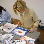
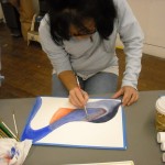
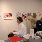
In the images here you’ll see students experimenting with complementary pairs in class. You can pick out the pure colors in their paintings -the identifiable stars with names that grab your attention, and the supporting cast of neutrals derived from them, created either with complementary pairs –usually orange and blue here – or with the addition of black and white. The single image is by Dawn Schneider.

